Offseason Uniformity Extravaganza!
Tuesday was an exciting day for uniform aficionados. We got not one, not two, but THREE new uniforms, all on the same day. Jacksonville's was actually scheduled for Tuesday, but Minnesota and Miami's uniforms were leaked as well. So let's take a look! First, the Jaguars. What to say about the Jaguars...hmmm. Well, their uniforms are definitely not the same uniforms they had before. The helmet is...different.
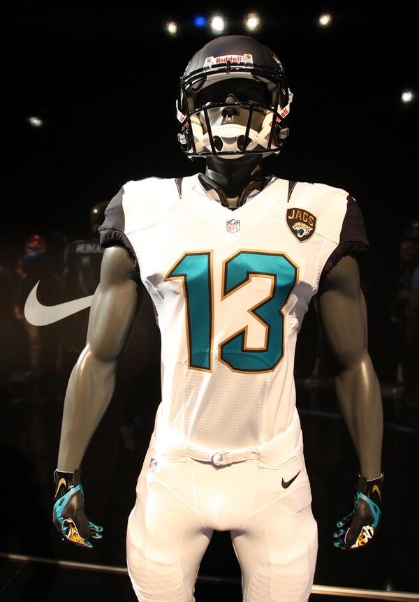
As you can see (there's a better look here), the helmet is two-toned, a first for the NFL as far as I know. On the one hand, it's unique and makes the logo decal pop. On the other hand, it's the kind of gimmicky gewgaw so common to lower-tier NFL teams.
The home uniform itself is again fairly nondescript.
The pants are bland. The jersey itself is bland, except for the shoulders, which are ridiculously busy (as you can see in the close-up shot). I already feel sorry for the poor radio and television play-by-play guys that are going to struggle to pick the shoulder numbers out of that striped mess.
Things actually get interesting on the away uniform.
While they still aren't overly exciting, the teal numbers (as opposed to black on their former outfits) is a nice touch, and I like to gold trim.
The teal alternates, meanwhile, are my favorite out of the bunch.
The colors here are much more visually interesting than the typical black home uniforms, and if I was a Jaguars fan I'd lobby hard for these to be the full-time home uniforms. Imagine how they'd sparkle in the Florida sun! The gold accents on the shoulder are a nice touch, and they get away from the horrific neckroll look that was so common around the league last year.
Overall, I'm not a big fan of the Jaguars' redesign, but it is an improvement over what they had before, and I do like the more prominent gold presence on these uniforms.
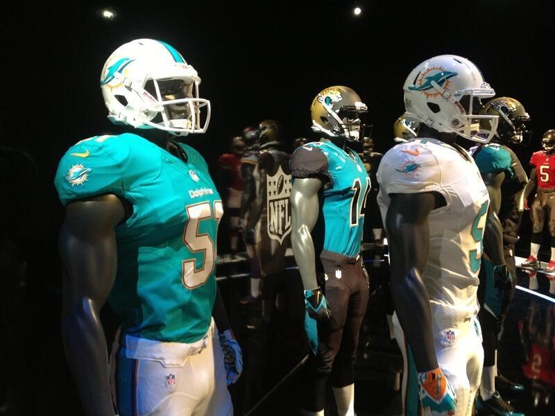
The Vikings and the Dolphins also dropped new uniforms today, supposedly due to a leak of some kind, although I have my doubts there. Anyway, here's what the Dolphins revealed:

I'll hold off on the full analysis until we see more, but it's pretty meh at first blush. The uniform overall feels almost unchanged, but they toned down the orange, which is a questionable move in my mind. If you have one of the more unique color schemes in the league, why would you want to take half of it away?
We'll also limit our discussion on the Vikings, since their full reveal isn't until later this week. In the meantime, here's what was leaked today:
Minnesota struck a compromise between old and new here. The font is new, the sleeve and pant stripes are old. The helmet also appears to have a matte finish now, which is always a good idea in my book. Overall, unspectacular, but probably a slight improvement over their Arena Football-esque uniforms of the last few years.
So that's what we know so far. An exciting day in the uni-verse, and a good appetizer before this week's main course of the draft.


