
Offseason Uniformity, Part 2: the Minnesota Vikings
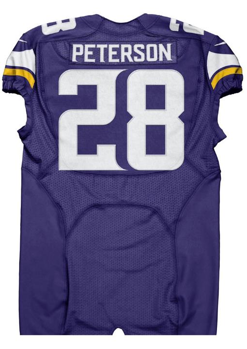
We briefly mentioned last week that the Jaguars, Vikings, and Dolphins all (intentionally or unintentionally) announced their new uniforms on the same day. You've already seen the Jaguars' new threads in detail, but we haven't taken a look at the Vikings or Dolphins yet. Since the Vikings are our neighbors to the west, it seems only fair and hospitable that we examine their uniforms first. The jerseys themselves aren't that bad, and they're a definite improvement over the Arena League-quality costumes they've been sporting the last few years. From straight on, they're admittedly pretty nondescript, but you'll immediately notice the different typeface for the numbers. It looks okay on certain numbers, like Peterson's jersey below, but on others (especially with repeated numerals) it looks weird.
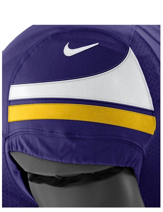
The sleeve stripes have improved, although when you can't see the side, the two stripe appearance looks a little funny. Here's a side detail.
The pants are where things get a little bit weird for me. Although I sometimes like it when teams go with just two stripes on their pants (like the Eagles and Redskins), the asymmetrical look just isn't doing it for me.
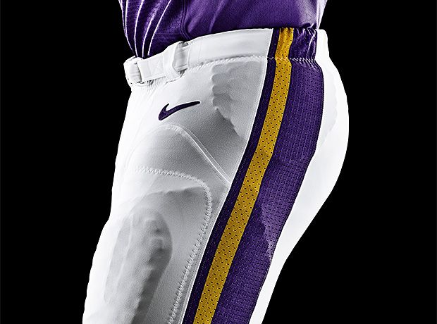
I will admit that it is a unique look, though, and not necessarily a bad thing. Here, though, it just feels like being different for the sake of being different.
On a bad note, though, the uniform set does include a pair of purple pants, which opens the door for this monstrosity...

Please, please no. Minnesota, you look bad enough in purple. You don't have to exacerbate the problem by adding more purple.
Overall, I think the new uniforms are a marked improvement. Although a bit plain, they represent an acceptable modernization of the Vikings' classic uniforms. I think we can give Nike a hesitant thumbs up on their effort here.