
Best Look/Worst Look - AFC South Edition

Welcome back to Best Look/Worst Look, and welcome to the AFC South.
Looking through these uniforms, I was surprised how much I found to like. None of these teams really have much in terms of long-term brand recognition, either having relocated from somewhere else or joining the league literally out of thin air as an expansion team. But there’s some solid enough uniforms here, though the AFC South will probably not go down as anybody’s favorite division for aesthetic reasons.
A quick reminder on how I do these: I only consider uniforms teams wore on the field during the 2023 season, excluding throwbacks and alternates. But given how many alternates are out there these days, if something that’s technically an alternate squeaks through, that’s okay.
Here are my picks for the best and worst uniforms in this division. As always, my word is final, immutable, and correct, and if you disagree, well, I completely respect that because opinions on things like fashion generally and uniforms specifically are very relative and personal.
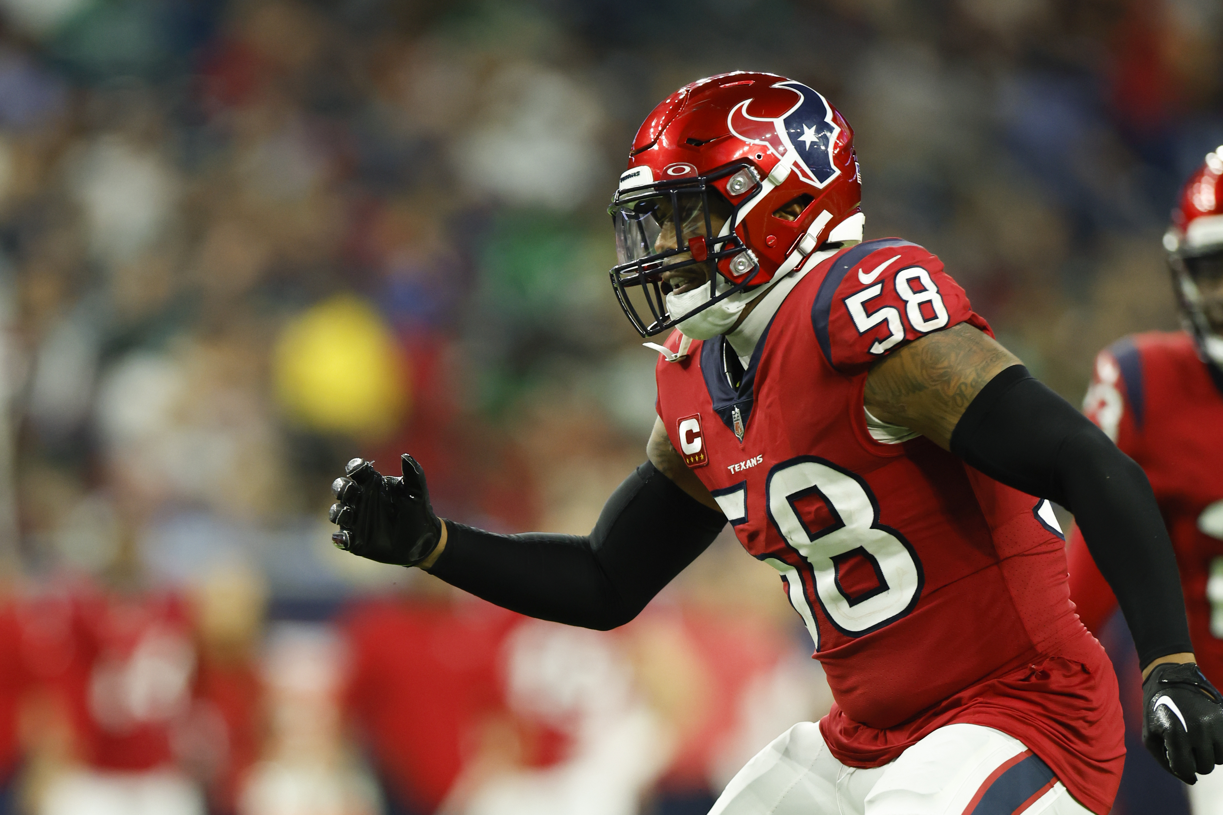
Houston Texans

I don’t know if I can give a firm opinion on the Texans yet, so consider these rulings very tentative. Generally speaking, I’d say I’m still feeling out their new uniforms, though it’ll be very fun to see them on the field for the first time this fall.
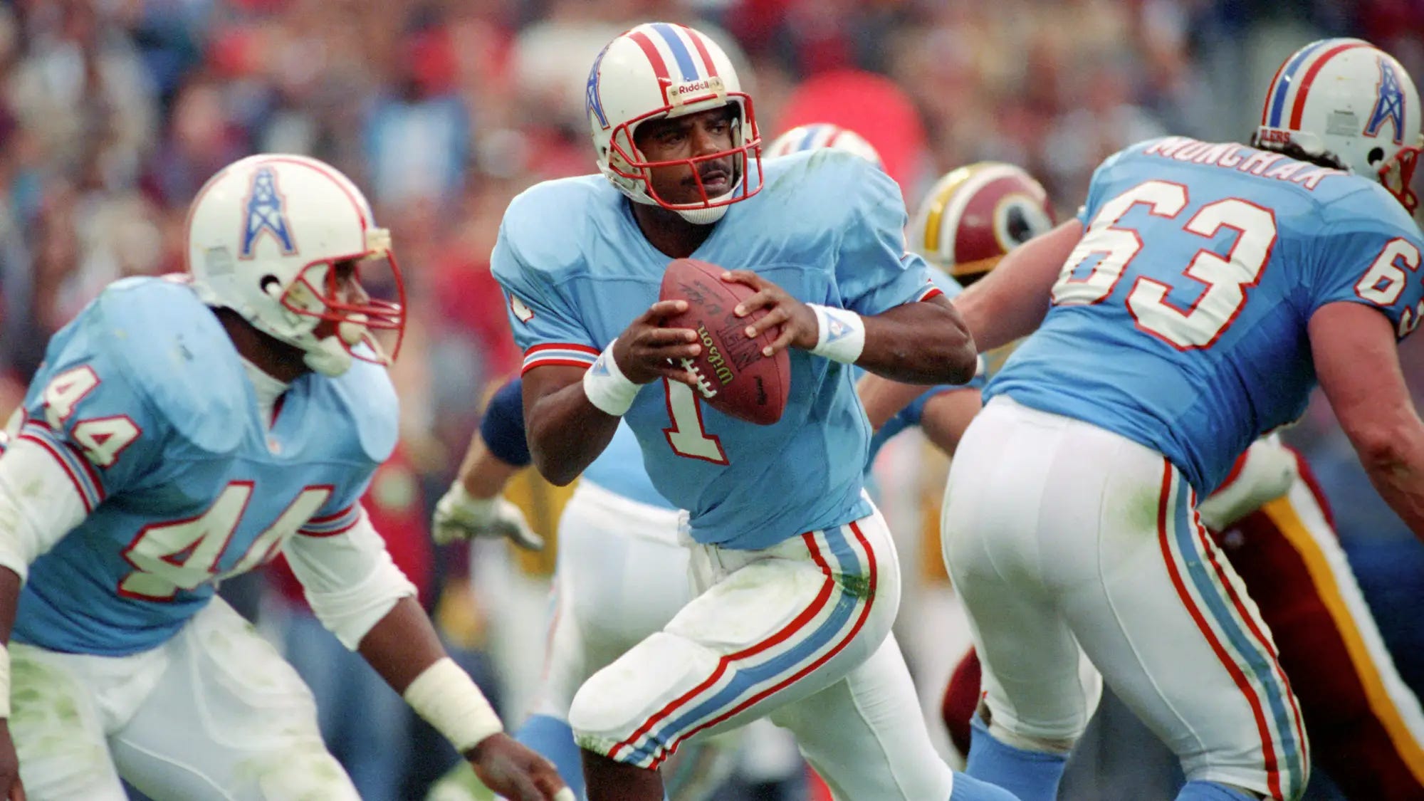
I think their best new set features their blue jerseys over white pants. When I think of a uniform update, this is basically what I imagine. It’s a nice, new interpretation of the “classic” Houston Texans outfit, which, impossibly, is now more than 20 years old. Tentatively, I’d say this looks pretty sharp!
The all-red ensemble is a bit much for me, but I think we’re going to have to see it on the field to be sure. I’ve liked previous iterations of their “Battle Red” alternates, though I think the effect got worse when they added first a red helmet and then red pants.
This is neither best nor worst, but I’m surprised how positive my initial reaction is to the Texans’ new all-blue alternates. I like the feel of it, and I like the incorporation of what I think they call “Houston blue” as a nod to the Oilers days
To read the rest of this post, support The Power Sweep on Patreon or Substack.